色彩理論グレイ色彩理論:グレーを操る
Color Scheme - 2025 -
グレーは白から黒の中間色にあたります。一般の方にとっては単なる「くすんだ」色であったり、「目立たない」色であったりと、あまり注目されない色かもしれませんが、デザインの世界では白、グレー、黒の扱いもとても重要です。
グレーという色彩が有する効果や性能、使い所は様々で、落ち着きをもたらしたり、高級感を醸成する働きもありますので、デザイナーとして一段上の表現力を身につけるためには、このグレーのコントロールが一つの登竜門となるでしょう。
なお、本サイトの色彩理論のページは実践的な部分を重んじています。 特にグレースケール、白黒、中間色、モノクロマティック配色に関する定義・解釈は様々であり、定番の専門書なども参考にして頂くことをオススメします。
波長域
| 色 | 波長 |
|---|---|
| 紫 | 380nm~450nm |
| 青 | 450nm~495nm |
| 緑 | 495nm~570nm |
| 黄 | 570nm~590nm |
| オレンジ | 590nm~620nm |
| 赤 | 620nm~750nm |

グレースケールは、主に印刷業界などで用いられる用語で、白黒やモノクロームとも違いグレーの濃淡で表現することを指します。スケールとは段階的に変化していく色を表し、灰色(グレー)とは直接的に関係のある言葉ではありません。グレー自体はどの特定の色域にも属すことなく、彩度が0(ゼロ)の状態です。
灰色の効果
| ポジティブ | 中立、知恵、知性、未来性、あきらめ(観念)、安定、威厳、妥協 |
|---|---|
| ネガティブ | クール(冷淡)、自信や活力の無さ、湿り気、冬眠、極端な退屈さ |
上品さと退屈さを併せ持つのがグレーになります。
なお、今回の名画の紹介およびAI作品は、グレーという定義に完全に当てはまる作品というよりも、主に白および黒基調の、階調のある、単色表現的な作品を扱っています。一般的な認知としての白黒の作品と考えて頂いても問題ありません。
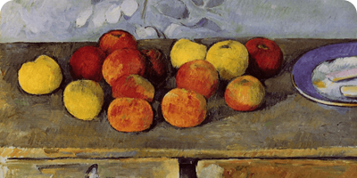
名画の中のグレー カラバッジョの作品の場合
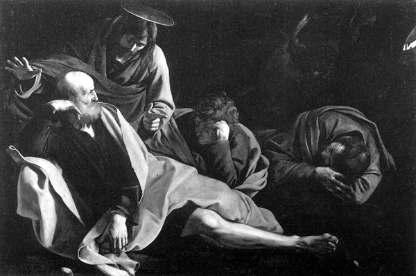
Christ on the Mount of Olives - 1604 -
戦時中に破壊されてしまったカラバッジョの作品。彼は光と影(シェード、陰影、ブライトネス)の表現を巧みに取り入れ、ルネサンス期の巨匠たちの珠玉の作品群にも全く劣らない作品を数多く残しました。
このようにグレースケール(調)で鑑賞することで、彼の卓越したビジョンがより明確になる気がします。
名画の中のグレー ビアズリーの作品の場合
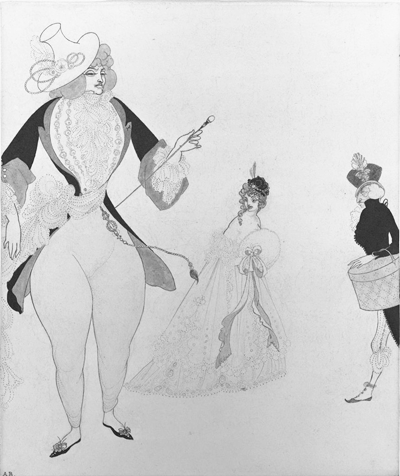
D'Albert in Search of His Ideals - 1897 -
オーブリー・ビアズリーのようにイラストタッチの作品を芸術として確立した表現家もいます。身近なものですと、書道や漫画などもグレー(や白黒)での表現の世界ですが、本作品が漫画の単なる一コマと異なる点はお分かりになるでしょうか。
それは左右の人物のドレスのベタ塗りの部分と、中央の人物の頭部のベタ塗りの部分で、ひとつのコンポジションを形成している点です。この構成力、こだわりがビアズリーの作品をアートと言われるまでに昇華せしめているポイントでしょう。
抽象表現主義の画家として地位を確立したフランツ・クラインなども日本の書に影響を受けたと言われていますが、彼の作品もその力強い構成に特徴を持ちますし、フォトグラフィの世界でも(時に「オーバープロデュース(やりすぎ)では」と思ってしまうような作家の方もいらっしゃいますが)作品の質を高める重要な要素として、コンポジションを重んじていきます。
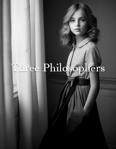
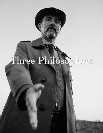
付録:AIによるグレー色(白黒、モノクロ)の作品
前述の通り、一般的な認知としての白黒の作品を生み出すべくプロンプトを入力してみました。日々進化するAIがどこまで写真や芸術の世界に迫れるか、興味は尽きません。
AI-Generated ArtWork - Prompted by
AI-Generated ArtWork - Prompted by
AI-Generated ArtWork - Prompted by
まとめ
実はこのThree Philosophersのサイト自体も(特にPC版は)様々なグレーを使い分けていますし、ブランドサイトのデザイン時などは、時に1/255のレベルの調整を何度も何度も繰り返して高級感を醸成していきます。(色彩には相対性も作用しますので些細な変化:たとえ1/255でも大きく印象が変化します。)
また、ちょっとした余白の差、グレーの濃淡の差だけでも、完成度には大きな差が出てきますので、ビギナーから中級者までは日々の修練が欠かせないでしょう。