TP Service
 About
About
Principal in Strategic Design & Abstraction
 Consulting Service
Navigating the Leap in Product Management
 AI-Era Value:
Unrivaled Expertise
Business / UIUX
 Dieter Rams
10(→3+2) Principles for Good Design
 Theory
A Professional Perspective: the Golden Ratio
 UI Design
Four essntial steps of Micro Interactions
 Behavioral Economics
Utility:The Psychological Wallet and the Complexity of Product Growth
 PdM / CPO
Navigating the Core: The Evolution of a Product Designer
 UX Framework
The Pros and Cons of User Interviews
Art
 Marcel Duchamp
Marcel Duchamp And Modern Art
 Donald Judd
Minimalism and Abstraction
 Storm Thorgerson
Intentional Ambiguity
 Color Theory
The Boundless Potential of Color's Influence
Product
 King Sun & Pipistrello
An Elegant Table Lamp
 Danish Minimalism
Futuristic design that remains timeless.
 PH 4/3 lamp
Object's presence and its harmony with the space.

OrangeColor TheoryCommanding Orange: Balance and Relativity
Color Scheme - 2025 -
Orange is a color of striking dualities; it embodies positive elements such as enthusiasm and recovery, yet it can also convey a sense of uninhibited intrusiveness. It serves as a symbol of action, adaptive change, and constant forward motion. Even when possessing a certain muddiness, the hue radiates a resilient, proactive energy.
Wavelength Range
| Color | Wavelength |
|---|---|
| Purple | 380–450 nm |
| Blue | 450–495 nm |
| Green | 495–570 nm |
| Yellow | 570–590 nm |
| Orange | 590–620 nm |
| Red | 620–750 nm |

Although orange lacks the carefree, pure innocence of its neighbor, yellow, its positive function is characterized by a unique capacity for rejuvenation and physical recovery.
The Psychological Attributes of Orange
| Positive | Sociable, Optimistic, Enthusiastic, Acclaim, Confident, Independent, Adventurous, Sophisticated, Agreeable |
|---|---|
| Negative | Superficial, Insincere, Dependent, Overbearing, Self-indulgent, Exhibitionistic, Pessimistic, Inexpensive, Unsociable, Overconfident, Gaudy |
Those drawn to orange are often noted for their indecisiveness and lack of persistence. They may lean toward unkindness or habitual joking, rarely viewing patience as a virtue. Under stress, they tend to become overbearing or bossy. Yet, in an age of turmoil, this unyielding and restless spirit may be precisely what is required to achieve success.
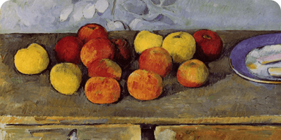
Orange in Masterpieces: The Case of Paul Cezanne
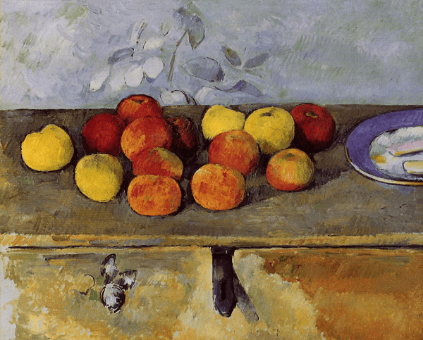
Apples and Biscuits - 1880 -
As featured in the section on yellow, this work by Cézanne showcases a deliberate arrangement of apples in shifting tones of yellow, orange, and red at the center of the canvas. The plate incorporates colors complementary to orange and yellow, resulting in an exquisite composition.
Orange in Masterpieces: The Case of Emil Nolde
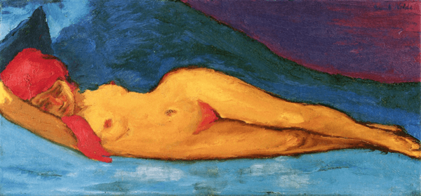
Reclining Nude - 1901 -
A masterpiece by Emil Nolde, a leading figure of German Expressionism known for his 'grand wildness.' Nolde’s use of color is singular; his wavelengths do not travel in straight lines. The skin textures he depicts in orange, appearing as if grown deep within the earth, evoke the image of seeds sown in the soil. By setting this against a blue background—the complement to orange—and weaving purple (the complementary color to yellow) into the far distance to balance the canvas. Through this work, we feel the elusive, primal force radiating from the color orange.
Appendix: AI and the Artistic Expression of Orange
When we think of orange, perhaps the vintage uniforms of the Houston Astros come to mind (The New York Times). With that classic aesthetic as my inspiration, I crafted an AI prompt to evoke a nostalgic, old-school look. There is something undeniably cool about that 1970s atmosphere.
AI-Generated ArtWork - Prompted by
AI-Generated ArtWork - Prompted by
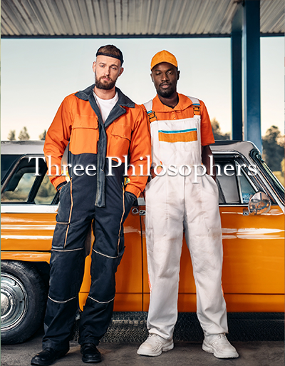
AI-Generated ArtWork - Prompted by
Summary
To conclude, orange is undoubtedly a powerful hue. While its color gamut is close to yellow, the distinction in their nature is clear. In the art world, Mark Rothko became a leading figure of his era by boldly harnessing the 'twisted' wavelengths of orange. Setting aside the core essence of art—such as the density created through drawing and composition—it is vital to recognize that color possesses a significant power to stir human emotion.


TP Service
About
Principal in Strategic Design & Abstraction
Consulting Service
Navigating the Leap in Product Management
AI-Era Value:
Unrivaled Expertise
Business / UIUX
Dieter Rams
10(→3+2) Principles for Good Design
Theory
A Professional Perspective: the Golden Ratio
UI Design
Four essntial steps of Micro Interactions
Behavioral Economics
Utility:The Psychological Wallet and the Complexity of Product Growth
PdM / CPO
Navigating the Core: The Evolution of a Product Designer
UX Framework
The Pros and Cons of User Interviews
Art
Marcel Duchamp
Marcel Duchamp And Modern Art
Donald Judd
Minimalism and Abstraction
Storm Thorgerson
Intentional Ambiguity
Color Theory
The Boundless Potential of Color's Influence
Product
King Sun & Pipistrello
An Elegant Table Lamp
Danish Minimalism
Futuristic design that remains timeless.
PH 4/3 lamp
Object's presence and its harmony with the space.