TP
 About
About
AI-Era Value:Unrivaled Expertise
 Consulting Service
Navigating the Leap in Product Management
 PdM / CPO
Navigating the Core: The Evolution of a Product Designer
Business / UIUX
 Dieter Rams
10(→3+2) Principles for Good Design
 Theory
A Professional Perspective: the Golden Ratio
 UI Design
Four essntial steps of Micro Interactions
 Behavioral Economics
Utility:The Psychological Wallet and the Complexity of Product Growth
 UX Framework
The Pros and Cons of User Interviews
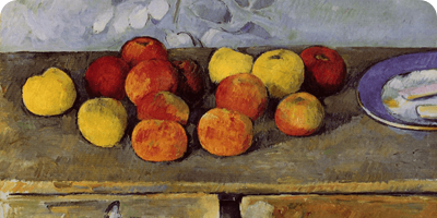
Art
 Marcel Duchamp
Marcel Duchamp And Modern Art
 Donald Judd
Minimalism and Abstraction
 Storm Thorgerson
Intentional Ambiguity
Product
 King Sun & Pipistrello
An Elegant Table Lamp
 Danish Minimalism
Futuristic design that remains timeless.
 PH 4/3 lamp
Object's presence and its harmony with the space.

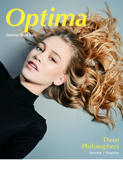
DesignFontsTypography: Optima
Typography - 2025 -
Designed by the legendary German type designer Hermann Zapf, Optima is a humanist sans-serif inspired by classical Italian inscriptions. While its proportions share an elegance similar to the serif typeface Trajan (*), its bolder weights reveal a more aggressive, powerful character, making it suitable for energetic compositions. It is widely used in international fashion magazines.
(*) The uppercase letters of Optima were modeled after the inscriptions found on the pedestal of Trajan's Column.
Optima Styles / Variants
| Font Name | Weights and Styles |
|---|---|
| Optima Regular | Regular |
| Optima Italic | Italic |
| Optima Bold, Optima Bold Italic | Bold, Bold Italic |
| Optima ExtraBlack | ExtraBlack |

Mac OS bundles five styles of Optima: Regular, Italic, Bold, Bold Italic, and Extra Black. It is remarkable how much the visual impression changes depending on the weight and the use of uppercase versus lowercase.
When used in all caps, each character possesses a commanding presence and sense of independence. While it may not reach the absolute level of Trajan due to its lack of serifs, its impact remains truly substantial

Optima Design Examples
In these design examples, I have used the original "Optima" spelling. One of the defining characteristics of Optima is the golden ratio found in the proportions between its x-height and the height from the baseline to the descender line. While it is true that keeping the type upright creates a more "disciplined" and refined look, the Italic variant is equally stunning, so I decided to feature it here. For the subheadings, I have unusually applied the Regular weight—a choice that I believe further demonstrates the inherent beauty of this typeface.
(*) There is a famous anecdote about Hermann Zapf during his conscription in WWII: he reportedly avoided being sent to the front lines after demonstrating his extraordinary skill by writing a general's name just 1mm high right before his eyes. The fact that his typefaces remain legible and elegant even at small sizes or thin weights is a testament to Zapf’s masterful craftsmanship. As you can see, even in the Regular weight, Optima maintains a remarkably solid and stable presence.
Summary: A Masterpiece Ten Years in the Making
It is said that Hermann Zapf dedicated nearly a decade to the development of Optima following his visit to Italy in 1950. When we hear the name "Optima," we often immediately envision a luxurious, sharp, and cool typeface. However, as mentioned at the beginning, its true identity lies in being a humanist sans-serif. It is truly a magnificent typeface that one cannot help but admire.
In 2003, a revised version titled Optima nova was released.